Analysis
Recency of Data
The purpose of the Analysis package is to enable you to analyse trends in data. Analysis data sets are updated nightly, concluding around 9am. Data is therefore accurate as of midnight the previous night, so will not accurately reflect short-term urgent data, e.g., upcoming arrivals.
Data Sets
The Analysis data is formed of three persistent data sets and one group of dynamic data sets.
The Bookings data set has one entry per booking. This is the data set to use for trending booking level properties such as revenue, numbers of bookings, source, and occupant types. Each entry contains all the key booking dates (Started, Confirmed, Cancelled, Arrival and Departure), Booking source information (Method, Repeat, Agent, Source, Discount Code), customer profile information (Group type, pets, occupant types and quantities, membership) and booking profile information (lead time, stay length, extended stay, advanced booking). Note: As the Booking ID column is the key column in this data set, it can’t be grouped on or aggregated, if you want to count the bookings use the Count column under chart utility.
The Occupancy data set has one entry per day per unit (=unit type). As the name indicates, you can draw occupancy trends from this data set. The data is pre-aggregated to be grouped by unit (a unit can be a grouping of plots which all have the the same unit type on). Each entry contains info about the unit (Stay type, Category), the occupancy (initial available, number/percentage sold, number/percentage available, number/percentage sold with/without pets, number/percentage that were repeats/new sales), the occupancy profile ( numbers of adults, children, infants) Revenue breakdown (total, total less commission, accommodation total, extras total, commission total).
Within the Occupancy dataset are columns with headers of the format Column 1/Column 2%. These tell you the percentage of the second column the first accounts for. For instance, for a unit with 2 Sold and 16 Initial Available on a given date, Sold/InitialAvailable% will be 12.5%.
The Daily Revenue data set has one entry per revenue source per day, making it a very detailed data set. Each row includes details about the booking source and booking customer profile and location, allowing you to chart any revenue stream by booking source and customer profile. The size of this dataset makes it slower to operate than the other data sets and we would recommend filtering the data first before trying to to pivot and chart it.
The Customers data sets are grouped by park and by reporting group (Holiday Booking, Owner Invoice, etc) and are dynamically generated based on the number of parks your company has and the number of reporting groups your company uses.
The Customers data sets have an entry per customer and provide details about the customers booking profile. Within each of these data sets are 2 reporting-group-agnostic Total Numbers (Life time total spend, Lifetime total Active bookings). All other numbers relate to the reporting group the data set relates to, these include: average spend per booking, average spend per year, average length of stay, average number or bookings per year (averages are calculated using only the last three whole calendar years data), lifetime number of bookings, lifetime cancelled bookings, lifetime spend, last year spend, current year spend, next year spend, Dates (first booking arrival, latest visit, last departure, next visit) Profile ( newsletter, marketing emails, blacklisted) Location ( Country, Region, Postcode District).
Note: If you want total spend across parks by customer you should use the Bookings data set and grouping by Customer ID.
Screen Size Responsivity
The Overviews will display on any size device you use, although for legibility, there are three schemes the Overview can take. On large screens the Overview will display with three columns, while on smaller desktop screens it will display with only two. On handheld devices this is reduced to one column, with all charts spanning the full width of the screen.
Chart Editor and Saved Charts areas are inaccessible on smaller devices.
Overview
The landing page upon navigating to analysis is the Analysis Overview. You may add multiple overviews, each having up to one heatmap and numerous charts, but initially the Primary and Default overviews will load.
The charts here are drawn from compressed data sets. This will cause a slower load time the first time you check an Overview in each day, to poll the reporting data and redraw the charts. If you see the Loading spinner, please be patient.

The Overview Name Dropdown in the top left allows for the selection of different overviews. Simply mouse over or tap the title and the dropdown will appear. Clicking the hollow star will assign it to be your favourite, loading it first. This is a company-wide setting.
Found in the top right corner are the Overview button (disabled while on the Overview) and the Saved Charts button, allowing for navigation to those respective areas. The Actions dropdown is only enabled while on the Analysis Overview.
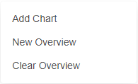
Within the dropdown are the Add Chart, New Overview, and Delete / Clear Overview buttons. The first navigates to the Chart Editor, where new charts and heatmaps can be made and later saved or pinned to an overview. The second will, after filling in the prompt to give the new overview a name, create then swap to the new blank overview. Depending on whether the current active overview is the Primary Overview, the third button will be Clear Overview or Delete Overview. This is because the Primary Overview cannot be deleted. Both require confirmation twice before being done. The Default Overview is even more restricted; it cannot be changed, nor its charts changed or deleted. New charts can be derived from them.
Additionally, if the layout of the Overview has been changed (order or size of charts) the Save Layout button will be present. Be sure to click the button if it is present to ensure you preserve the overview’s new layout. If you remove or add a chart to an overview, it automatically saves.
At the bottom of the Overview is a notification informing you of when the reporting data was last updated. Any data since the provided date will not be reflected in the data.
Overview Chart Controls
Charts on the Overview have a set of controls beneath them.

The Save As PNG button downloads a PNG version of the chart with its name generated by the chart’s title (if applicable) and a timestamp when the download was made.
Download as XLS will download the data behind the chart (post-aggregation, if applicable) as an Excel Spreadsheet file type.
The Edit button navigates to the Chart Editor with the selected chart loaded. From there, you can see the data and settings behind the chart. You will be prompted to overwrite the overview chart only if the altered chart’s title is the same as the version on the overview.
Note: changes made after clicking Edit are not necessarily reflected on the Overview.
The Remove Chart / Remove Heatmap button removes the associated chart or heatmap from the overview. If the chart has been saved, it can still be found in the Saved Charts area.
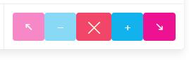
The Green Burger button expands the Position Controls for the associated chart and is not available for the heatmap.
The Up-Left Arrow button moves a chart left until it is against the left-hand side of the page, then moves it to the right-hand side of the next row up. It is disabled if the chart is in the top left position already. The Down-Right Arrow button works oppositely - although without leaving whitespace to the left of any chart - and is disabled if the chart is in the bottom right position.
The Minus button downsizes a chart from two column widths to one, and its contemporary, the Plus button, upsizes a chart from one column width to two. These are disabled if the chart is already one column width or two column widths, respectively.
The Cross button collapses the Position Controls back into the Green Burger and is never disabled.
Note: whitespace may be present to the right of a chart when the following chart is too wide to fit into the gap available.
Overview Chart & Heatmap Features
Overview Charts keep all the features present when they are made in the Chart Editor. However, due to the change in size constraints, charts may appear less legible or more cluttered than expected. Take this into account when making a chart.
Overview Heatmaps are slightly different than they are in the Editor. They lose their value preview on region mouseover functionality, but clicking a region will still give you a popup with the region’s value.
Only one Heatmap may be on an Overview at a time, but more heatmaps may be saved in the Saved Charts area if you wish to have multiple region-grouped visuals at-hand but do not want them on their own overviews.
The heatmap will automatically adjust its minimum and maximum when new data requires they be adjusted such that an Overview Heatmap will always show the full range of values it is charting, contrary to the Chart Editor Heatmap, which can have its range manually limited.
Whenever a chart is added to or removed from an Overview, the overviews are automatically saved. If you wish to add or remove a chart but want to undo layout changes, refresh the page to abandon the layout changes, then add or remove the chart.
Chart Editor

Clicking the Add Chart button will take you to the chart editor. As all the data sets are required here, there may be a load time (depending on your Overview). If you see the Loading spinner, as with the Saved Charts area or Overview, please be patient.
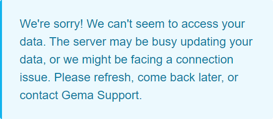
There is a possibility that your analysis data will still be being updated when you try to access it. Under these circumstances, or if there is another connection issue, an alert message will appear. Try returning to the Analysis area an hour later. If it persists, feel free to contact Gema Support.
The Overview and Saved Charts buttons (in their usual top-right position) allow for navigation to their respective areas, but the Actions dropdown is disabled while on the Chart Editor.
Chart Editor Controls Bar
The Chart Editor Controls Bar holds the table-wide controls needed to operate the Chart Editor.
The Data Source Dropdown allows you to select which data set you want to analyse. The table will try to retain as many common settings as it can when you change data source, so use the Reset Grid button to restore the grid to its default state when you desire.

The Expand Chart button allocates more space for the heatmap or chart; the heatmap’s controls will be hidden to make more space, while with a chart the grid will be shrunk. Having clicked this, the button will instead say Shrink Chart which will revert the Chart Editor back to its original state. This is particularly useful if you want a larger chart graphic, because the clipboard or download version of the chart will also be larger.
The Pin To Overview dropdown provides a list of overviews to pin the current heatmap or chart to. The only chart or heatmap settings that do not commute to the Overview are the Heatmap Range settings. However, due to the change in size constraints, charts may appear less legible or more cluttered than expected on the Overview. Take this into account when deciding whether to pin a chart or to use the Save Report button. If the name of the new chart matches the name of a chart on the chosen overview, you will be prompted to overwrite it or cancel it; no two charts of the same name should be on the same overview. Additionally, it will be saved to the Saved Charts area too.
The Save Report button adds the current Heatmap, Chart, or Table to the Saved Charts area. It will copy the name from a Heatmap or Chart, while a saved Table will have a generated name.
The Reset Grid button restores the Chart Editor to its default state, as a shortcut to manually disabling the settings.
Altering the Table
After selecting a data source, a table will show containing the data.
Clicking on any of the headers will sort in Ascending or Descending order. By holding shift, you can apply sorting to multiple columns. Column Groups may be expandable and collapsible, as indicated by the right- or left- arrow next to the column name.
On the right side of the table is the Table Tool Panel sidebar, with the Columns and the Filters tab.
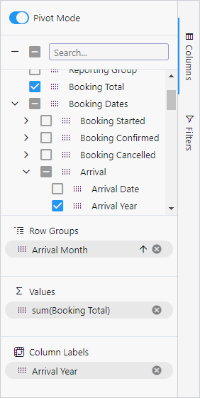
Within the Columns tab, the checkbox determines which columns are visible in the grid. All columns can be enabled or disabled via the top checkbox, as can all columns within a group via that group’s checkbox. By default, many columns will default to invisible.
Within the Columns tab, use the 12-dot grab handle to drag a column into the Row Groups area, grouping the data by that column. Dragging a value column to the Values area will allow you to select an aggregation function to apply to that value by the above groups.
Enable Pivot Mode with the toggle at the top of the Columns tab. This consolidates the table down into Row Groups and Values, and enables the Column Labels area into which you can drop another column. This will use the values from the selected column to form headers for your pivot table.
The Filters tab grants you the ability to filter any column. These filters always apply to the underlying data; resulting aggregation data cannot be directly filtered on. They fall into two main categories: Select filters require you to deselect values you wish to have filtered out, while Mathematical filters require you to use equalities or inequalities to limit the range of values you wish to include.
All dates come in five columns. The Date, Week, and Year-Month filters are mathematical while the Year and Month filters are selection. For example, all results from 2021 onwards could be achieved by deselecting years prior to 2021 via the Years column filter, by taking Greater Than 12/31/2020 in the Date column filter, or by taking Greater Than 2019.12 in the Year-Month column filter.
Dates have an X Days filter, allowing you to take a dynamically-updating slice to chart as an alternative to manually updating a chart. Arrival Year and Arrival Year-Month both have a Last, This, Next filter available. These will ensure the chart always reflects the same time period relative to you.
Making a Chart
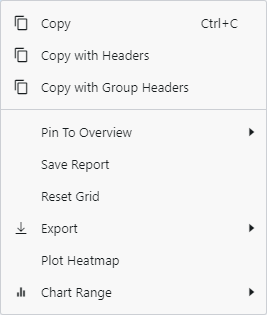
If you only wish to chart a portion of the table’s data, drag a box over the data you wish to plot, right-click to open the Context Menu and select the desired chart type within the Chart Range popout.
This can be done even if Pivot Mode is enabled if only some of the pivoted data is desired. However, it is better to filter out undesirable data and to use the Pivot Chart popout if possible. This ensures that, if new data causes a new Column Label to be generated, the chart will be able to include it too.
To involve multiple series in a chart, multiple value columns need to be within the selection range when using Chart Range, or a Column Labels column needs to have been selected when using Pivot Chart.
Altering the Chart
After having made your chart, double-clicking the title will allow you to edit the title. In addition, upon mousing over the chart, three buttons will appear in the top right corner.
The Chart Tool Panel can be opened by the 3-line burger button.

The chain link button unlinks the chart from the table, allowing you to change the table without losing the chart. Note: Pinning an unlinked chart to an Overview will prevent it from updating regardless of changes to the Analysis data.
The download arrow starts a download of the chart in its current state as a PNG, using the chart title as the file name.
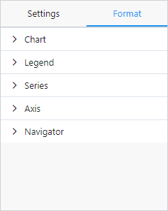
Within the Chart Tool Panel are two tabs. The first, Settings, allows you to change the chart type by selecting one of the diagrams within the list. You can also cycle between different chart themes, from our colourblind-friendly high-contrast theme to a more muted rainbow theme, via the left and right arrows at the bottom, or swap between them via the circle buttons.
Note: changing chart type or theme will revert Format changes back to their defaults.
The Format tab has sub-divisions, each with settings relevant to that portion of the chart, some of which are covered in the following section.
Useful Grid Tools for Charting
To empower you to get the most out of your data, there are some less intuitive but more powerful Columns and Aggregation Functions for some sets of data.
Most columns have the Count aggregation function available, but a Count column is provided for ease of use. Its default aggregation function is Count, but it has Cumulative Sum available too.
The Year-Month column allows you to easily group data by Year-Month, such that you may see a time-series trend grouped by month year more reliably than using two Row Groups.
The Year To Date Compare column shows which bookings have been made prior to the current date (month and day) within its own year. Filtering it to True will allow you to plot previous years’ data up to the current date.
Booking Month Day Comparer gives you the year-agnostic date (month and day).
The Cumulative Sum aggregation function cumulatively sums down columns, considering any sort applied to the grid. By swapping Row Groups and Column Labels columns in Pivot Mode, the axis of cumulation can be swapped.
The Percent function, only available on percent columns, calculates the overall percentage within the grouping, such that the result is .
With how the Overview displays a chart, you may wish to disable the Legend or move it to below the chart, as is available in the Legend sub-division. Also for Overview legibility reasons, the axis labels can be made smaller or rotated in the Axis sub-division.
Enabling Labels within the Series sub-division displays data labels on the chart, though these can be less legible than Tooltips (also available in the Series sub-division) which are on by default. They are however lost if you copy the chart or save it as a PNG.
Saving the Chart
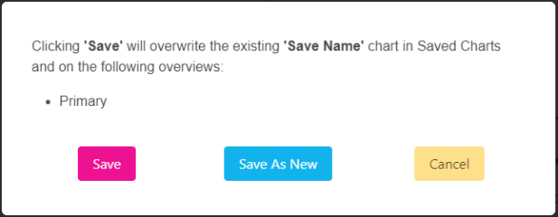
When you save or pin a chart, you will get a prompt. The name of the save will match up with in the Saved Charts area and typically includes the chart’s title.
If it is not from a loaded chart (either from clicking Edit on an Overview chart or clicking Load in the Saved Charts area) you will be able to Save As New / Save As New & Pin or Cancel your save.
If you have loaded a save, Save / Save & Pin will overwrite the save you had before both in the Saved Charts area and on all overviews that save is on. To this end, the prompt lists the overviews effected should you choose to overwrite.
Heatmaps
To make a Heatmap, two conditions must be met to get a dependable Heatmap:
Pivot Mode must be enabled (and a Values column used).
The grid must have its Row Group set to Region.
By having a Column Labels column set, the heatmap might not accurately reflect column of your choosing. Instead of selecting a Column Labels column, filter out every value except one at a time on that column, and compare the resulting heatmaps.
After clicking the Plot Heatmap button in the Context Menu, a Heatmap should appear on the left. It will try to dynamically reflect changes made in the table, for instance if the aggregation function or Values column are changed.
The Expand Chart button will zoom the heatmap in and hide the Heatmap Controls Panel, and conversely clicking Shrink Chart button will restore it to its zoomed-out state. When you mouse over a region on a Chart Editor Heatmap, you will get a preview of the associated value, and as with the Overview Heatmap, clicking a region will display a popup about the region.
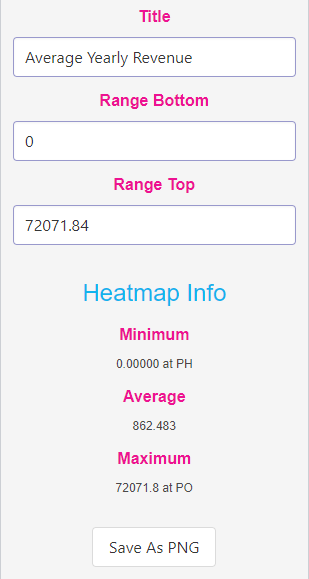
The Heatmap Controls Panel has an input for the heatmap’s title, as well as two for manually limiting the range the heatmap covers. The heatmap automatically scales its colouring from grey to red between the range bottom and the range top. Any regions that fall outside this range have a different default and mouse-over colour. Manual range values will be wiped if the table is changed, and do not get saved to the Overview or the Saved Reports area.
The minimum, average, and maximum are drawn from the table prior to manual range adjustment, easily allowing you to restore the heatmap to its original state by returning the range values to their initial ones.
The Save As PNG button downloads a PNG of the heatmap using its title and the current timestamp as the file name.
Saved Charts

The Saved Charts area is used for managing saved tables, charts, and heatmaps in a place that avoids having to clutter the Overview with them. Similarly to the Chart Editor, if you enter the Saved Charts area without having downloaded the analysis data (by visiting the Overview for the first time in the day, or subsequently by visiting the Chart Editor) the Loading Data spinner will show while your analysis data is retrieved.
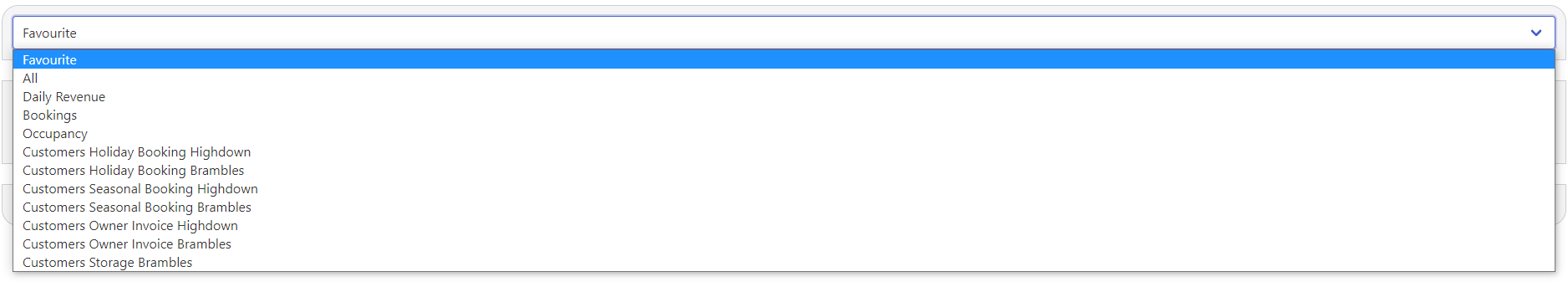
The Data Source Dropdown selects which data set you wish to view the saved charts for. All the data sets discovered will be in the list, regardless of if there are any associated saves. The All option shows you the saves from every category, while Favourite (which is the default) shows only your favourited tables, charts and heatmaps.
If you have used the Save Report button in the Chart Editor, the Saved Charts area will automatically select the relevant data source for the new save, showing you the save you have just made. If it is a Table, it will have a generic ‘New Save’ name, while new Heatmaps and Charts will default to the title used for them.
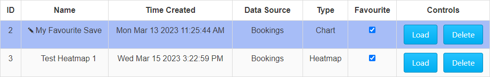
Saves will sort first by Favourite, and second alphabetically. This means that if, for a given group, you already have other saves, a newly-added save may not appear at the top of the list.
Clicking into a Name cell will enable you to edit it. Changes are automatically saved when you click anywhere else on the table, or if you press Enter, as shown by the input box returning to text.
The Time Created shows you the time of creation of the given save. If you cannot find a new save you have made, check this column to find the one which matches up to the save’s creation time.
If the selected category is All, Data Source will tell you the data set the given save is for. This column does not appear if a data source has been selected via the Data Source Dropdown.
The Type informs you whether the save is a Table, a Heatmap, or a Chart.
The Favourite checkbox allows you to mark a save as a favourite. This elevates it above the non-favourited saves. Multiple saves within a data source can be favourited and will sort themselves alphabetically above the non-favourited charts, which are also alphabetically sorted.
The Load button opens the selected save in the Chart Editor, while the Delete button removes a save after confirmation.
Note: Saved Charts that are on the Default Overview can not be edited, deleted, or favourited.